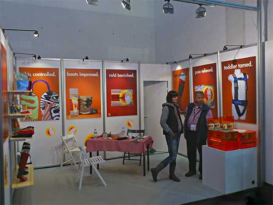
As I write this, ISPO Munich in Germany has been and gone for another year. By all accounts, the show was a great success for all of my contacts who attended and it’ll be interesting to follow up with them in the coming weeks.
Over the course of this 2-part article, I’m going to talk you through the process of how I created a series of photographs for one of my outdoor clients who was exhibiting at the show.
I love seeing my work in large format, doing what it’s designed to do – but of course, the images I was commissioned to shoot were just the end product. It’s what led up to that point that is the key to their success.
To give you a frame of reference, here’s a snapshot sent by the client, showing the display panels as they appeared on the stand:
First up, a little back-history about the build-up to the shoot itself.
It all started with a phone call, followed by a meeting a couple of days later – and from the start, I was told that there was a real urgency to get these pictures done asap in order to meet looming deadlines. Not a problem; I often get last-minute requests or seemingly impossibly time frames to work within. I like a challenge, and there’s none better than being informed of an absolute cut-off point!
Having talked over various issues – from the improvised studio setup we would use (because, for logistical reasons, it was better to shoot on location in their warehouse), to how the pictures would ultimately be supplied for print – I turned up ready and raring to go.
And that’s where the first obstacle became apparent.
During our pre-shoot meeting, we picked the best area for setting up the studio. The plan had been to light the background then, about 6-8ft in front, the products. The camera would be about 4-6ft in front of that, allowing an aperture of around f/11 for plenty of depth-of-field (in-focus area), at the same time nicely blurring the backdrop.
However, when I turned up, I was told that area was no longer an option (ah, health and safety, you blighter!), but that another section of the warehouse had been prepared. Wish I’d been told sooner.
In the picture above, the full length of the area spanning the board in the bottom left-hand corner to well beyond the black and white boxes had been the intended set – but as you can see, it was a far smaller area I was given! More of this later.
The second obstacle to overcome related to the background itself.
Because of the last-minute nature of the shoot, I wasn’t able to order a seamless backdrop and have it delivered in time, as I would normally (we needed orange; I don’t generally keep an orange background handy). So good old improvisation was required.
A quick dash to a local art supplies store for several pieces of card was the compromise in the couple of days before the shoot; these were ultimately taped together as tidily as possible using double-sided tape – doing our best not to show any joins. Far from ideal, but you do what you have to do.
Now, some of you might say “Why didn’t you just shoot against a white backdrop and gel your flash orange? Or shoot against white and change it to a different colour in Photoshop?”.
Both are equally valid points but there are two reasons I chose not to – firstly, I’m a purist and I like myself and my clients to see, ‘live’, what the shot looks like as it is built up. Secondly, I was keen to keep the post production work on that front to a minimum on this occasion, due to the time constraints.
One thing to bear in mind before and during this shoot was the final size of the images; they would be printed at A0 (47″ x 33″ approx.). In real-world terms, this meant that every spec of dirt, every hair, every unwanted detail would show unless it was taken care of at the time of arrangement (or, of course, in post production).
In order to get the best start at this, I chose my Nikon D800 which, combined with glorious, crisp flash light, would produce razor-sharp files more than capable of handling the enlargement. The lights themselves would be fired using Pocket Wizard triggers.
Perhaps it goes without saying, but a a tripod was crucial, for a number of reasons. Of course, it was there to make sure there was no movement of the camera itself (I also used a remote release to save jarring, too) – but also, it allowed us to constantly tweak the products/lighting and take test shots without having to recompose the frame each time.
That was basically it and the scene was set. In essence, quite a simple setup. Next came the fun bit – the picture-making.
Be sure to take a look at Part 2 – right here – to see how the set of pictures came together!


