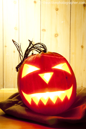
So, it’s that time of year again. The spooks are out and so are the inflated pumpkin prices. But come on, now… this is not the time for bah-humbug – it’s the time for having fun creating some interestingly-lit photographs based on this seasonal theme!
The technical details about how I created the picture above are not necessarily specific to halloween or pumpkins; the keener-eyed amongst you will note that long exposures are typical of many night-time pictures and the injection of additional lighting is pretty standard for the way I often work during daylight hours.
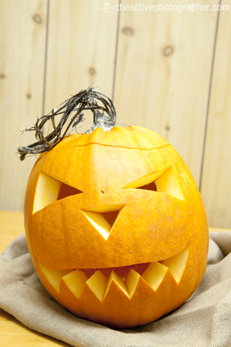
So then, first things first. Here are the ‘raw ingredients’ of my photograph. Very simple, really – a pumpkin (with suitably spooky face), an old hessian sack, a kitchen table and a wood panel kitchen wall.
The camera was mounted on a tripod, focus set (an left in manual mode, so that there would be no need to re-focus at a later point) and the light switched off.
Having carved the pumpkin earlier, the first step was to take my main exposure reading directly from it; this would form basis of the picture as a whole. Lighting was provided by a single tea light candle placed centrally inside.
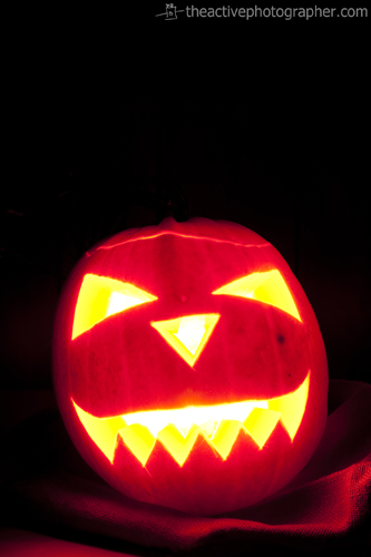
Letting the camera expose for the brightness of the glowing face – 30 seconds, f/11 – naturally sent the background into near total darkness, but this was quite deliberate. These values were kept constant for all pictures that followed. Here’s what I ended up with:
Note the lovely warm glow bringing out the texture of the hessian sack and the colour of the wooden table in the bottom left corner; these warm materials were specifically chosen in order to compliment the richness and colour of the pumpkin.
I could have just stopped there. It’s a nice enough picture, one for the family album, but I wanted to add a bit more drama to the frame. Taking the idea of a kitchen as the scene, I had in my head the plot of an evil pumpkin, freshly escaped from it’s bag, looking menacing.
A bit far-fetched? Ok, maybe. But that thought meant I then needed to do something to spice-up that oh-so dark area at the top of the frame. Remember, there’s wood paneling hiding in the depths of that background.
Now then, here’s the fun bit – adding another light source and balancing it with the ambient (exsiting) light.
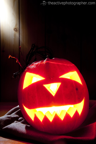
Enter one small flash gun, placed on a stand towards the back left of the table and fired remotely using Pocket Wizards. This needed to serve four main functions – 1. add light, 2. add colour, 3. add texture, 4. add depth – so was angled to strike diagonally across the background.
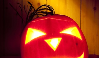
From this test shot, you can see that the positioning was all wrong. Basically, the flash was pointing too far backwards. A little adjustment and the second test proved more successful, although the intensity of light was too much (easily remedied by turning the power down a fraction).
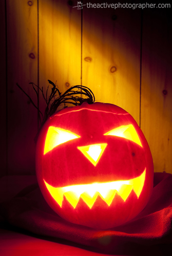
Firing a light at a flat surface is all very well, but of course it bounces off, lighting whatever comes in its path. The result in this instance would be something like the picture you see below.
By using a gobo, basically any kind of go-between to stop the light spilling across the set and also into the camera lens, it’s much more controlled.
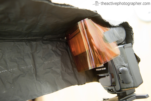
There was also another consideration. The first results produced, even with the use of a gobo, just weren’t dramatic enough for me. I wanted to retain lots of that rich shadowy darkness and I knew that a sneaky little accessory would be perfect – a grid, placed over the front of the flash, which would narrow the beam of light.
That worked a (trick or) treat.
Ahem. Anyway…
With the additional lighting in position, it was time to warm it up a bit, using coloured gels you no doubt noticed in the last picture. Many of you will be familiar with CTO (colour temperature orange) correction filters which are simply placed in front of lights for effect. Well, on this occasion, and following another couple of tests, I ended up using two – a Full CTO and a 1/2 CTO, stacked one on top of the other.
My halloween picture was created ‘just because I can’. No client, no brief, no problem (well, unless you count Office Cat and Studio Cat doing their best to trip me up in the dark). Making illustrative images should be a fun process and often gives you a great opportunity to experiment with different lighting and/or effects.
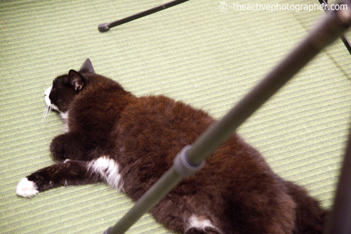
My ‘helpers’:
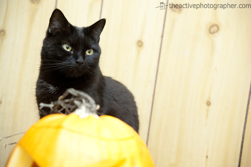 Office Cat (above) & Studio Cat (below)
If you’ve taken similar halloween pictures, feel free to drop a link in the comments section – it’ll be great to see what you came up with!

Nice pumpkin shots. I may have to relight last nights pumpkin and play a little tonight! Glad to see you didn’t over work the office cat (studio cat looks like it was a tough shoot!!!) Just kidding – my two cats get involved too! (One helps me with writing – the other acts like a paper weight – will keep anything down in the wind!!!)
Played with the camera last night – check out my first strobist attempt – the last 2 pictures in the post! Was a challenge to get the focus on something so small, but I was really happy with the end results!
anitamacphotos.wordpress.com/2011/11/01/daily-photo-challenge-letter-f/
Thanks for chipping in, Anita!
Oh yes, the chaps are always very helpful, most usually when I don’t need them to be! With the cooler weather now heading our way, I’m going to be facing the usual fight for office chair domination from Penfold (Office Cat).
Did you revisit your pumpkin for some extra shots? If so, it’d be great to see the results. As for working with flash – once you get going, you’ll soon get the bug and want to keep doing more and more tests!
Well done with your focusing technique in those last couple of pictures – like you say, certainly a challenge!