At the start of each year, it’s not unusual for us photographers to pause for thought, looking back on the year that has just been and looking forward to projects yet to happen.
The Goodwood events which I shoot each year – the Festival Of Speed and Revival – now seem like an ever-distant memory, as does the process of working my way through 1000s of images in the week that followed each event. As ever, those were prepared for supply to the Goodwood Photo Library (and, by association, various sponsors such as Porsche, Veuve Clicquot and RBS), and will have by now done what they were intended to do.
Having shot these events for around 10 years, I always look forward to the challenge of finding new angles, capturing images which are only there for the taking on those specific days in the calendar.
Every now and then something stands out photographically, giving me that little bit of extra satisfaction. Bizarrely enough, the Everest display at the Revival was one such feature for 2013 and the area which delivered perhaps my favourite set of pictures.
Maybe it’s because I’ve taken more of an interest in the history of Everest over the past year. Maybe it’s because the display was something just that little bit different. Or maybe it’s simply because I was delighted to find an outdoors-based theme in an otherwise motoring/vintage setting!
Regardless, I’d like to share a few thoughts surrounding one of the images I captured…
Now, one thing to bear in mind with my Revival pictures generally is that they are intended to realistically portray the atmosphere, energy and overall feel of the event. For this reason, I don’t tend to inject too much trickery into them (either at the time of capture or in post production). Sure, lighting and focus play a big part, but it is always my intention to keep them ‘accurate’.
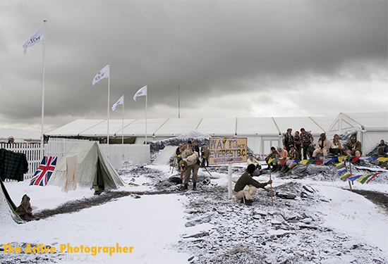
So what do you do when presented with a scene such as the one below?
On the surface, pretty uninspiring – and I’m pretty certain there wasn’t a corporate hospitality tent at Everest Base Camp in 1953! Visually and aesthetically, the tent ruins the picture – but I had to capture the overall scene for the sake of my brief. With that done, though, it was time to have some fun…
Armed with my Nikon D3 and 24-70mm f/2.8, and keen to extract as much out of a scene as possible, I gradually moved around the display, narrowing my field of vision and selectively picking the subject(s) for each frame. The trouble was, at every turn, there was always some form of reference to the modern day in the background – whether it be members of the public passing by or that monstrous hospitality tent.
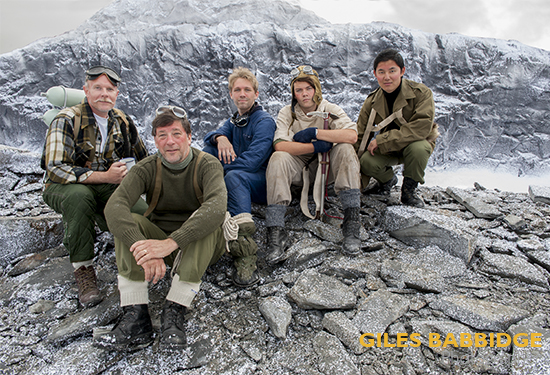
Thankfully, there was one group of chaps that caught my eye, which I knew I’d be able to work with to get the shot I wanted. I decided to concentrate on isolating them for the cleanest shot possible.
Here they are…
Not a bad bunch and very easy to work with, thankfully. I explained what I wanted to achieve and they were more than happy to pose in different positions so that we could get the right look.
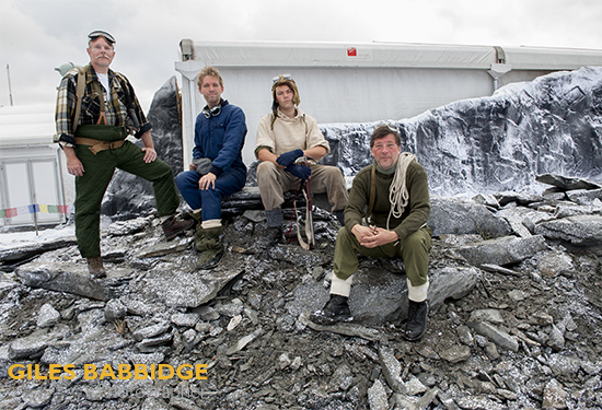
So what do we think? Well, the above picture is never going to win awards (it was never designed to) and the actors could have been better positioned. But as a starting point, it wasn’t bad. The challenge, though, was how to work around the structure in the background. Yes, I could Photoshop it out after the event, but looking at the immediate surroundings, there really wasn’t a lot to work with. Much better, then, to re-position the men.
Looking to my left, there was another area which immediately offered more potential. It even had the outline of Everest (albeit not to scale, relative to where I would pose the men). But it was a good starting point. This is what it looked like:
See what I mean about the scale being all wrong? By far the best way to get around this, then, was to go for the close crop, which in turn would focus attention on the characters.
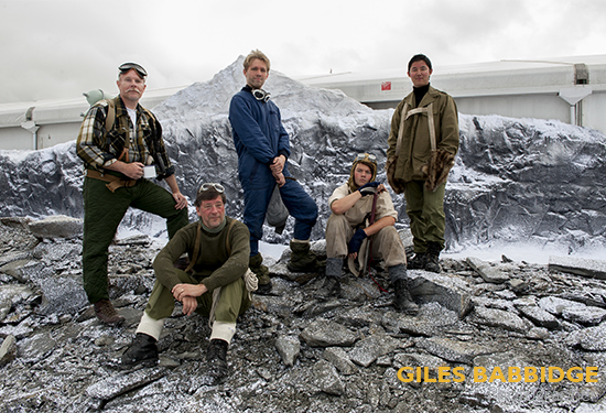
Going in close, one thing soon became very clear; the colours in the scene – the chaps’ clothing, the white/grey of the rock and snow – had a striking resemblance to those in pictures shot in 1953. In this Goodwood setting, you could probably attribute this in part to the bright overcast lighting reflecting up off the false snow on the ground. Perfect.
So, the resulting image…
As I said right at the start, I generally don’t do a lot of post-production on general event shots – there’s simply not the need – but on this occasion, I chose to play around a little. Referencing the Everest book (see link above) to make the most of those colours, I also had to take care of that background – a simple enough job of removing the hospitality tent and replacing it with a suitable-looking sky.
What I like so much about this shot, in addition to the realistic tones and colours, are the individual expressions on these guys’ faces. Not such a surprise, really, when you work with professional re-enactors who have researched their characters – people like them really do make my job easier.
Seeing the Everest display was probably just what I needed at that weekend. Shooting images primarily for brand/marketing/PR throughout the event, it’s easy to get drawn into a certain monotony unless you look for opportunities which appeal and play to your strengths. Each event always has its own challenges and rewards for those willing to think laterally – and on this occasion, I came away with something just that little bit different.
For those of you interested in the technical, the final picture stats: 1/100th sec at f/8, ISO 400, lens set to 24mm, handheld.

